top of page


Ride Without Safety Concerns
Role: Product designer
Collaborators: Senior PM, Front-end engineers overseas
Launched in 2020
5-star rating app
3.2 million users

The T3 company is different from Uber

Camera in the car

Physical buttons in the car
The ride-hailing environment is unsafe

China has the world’s largest ride-hailing market with about 20 million bookings per day.

After two riders were killed by their drivers in 2018, safety became a big concern for riders.
Diving into user safety issues
We surveyed more than 100 ride-hailing app users to understand their real needs and found that 60% of the orders came in between 8:00 p.m. to 10:00 p.m. Safety was their main concern.
100
Industry Surveys
6
Competitor Analysis
12
Interviews

Storyboard


Vivian always prefers to use the ride-hailing service at night.
She notices some unexpected behaviors from the driver and worries about her safety.
Calling 911 is an option, but maybe it is not the best choice.
The Problems
According to the research above, we decided to focus on three pain points:
1
How to trust the driver
Driver's identity
Enhance the driver's identity and the car information
2
Get to know the V.D.R
V.D.R System
To understand the V.D.R safety system on the onboarding page and the pop up
3
Safety concerns
Safety Measures
Display the "Get Help" button and get help for different options through this function
We brainstormed in our group and with the client. We analyzed all the safety problems and solutions
The Solution-1
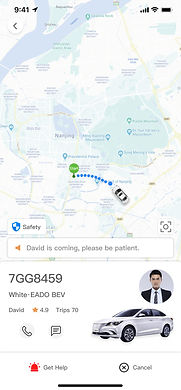
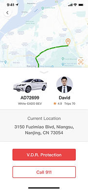
Enhance driver's identity and car information
The problem: How could the riders trust a driver who was a stranger?
The goal: Provide more information to identify the driver to make him more trustworthy.
Don't trust
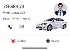
Driver's ID
Plate number
Car's photo
Driver's rating
Rider's feedback
Trust more
Driver's real photo
Iterate
Original
After
Final (Day time)


Cartoonish photo of the driver.
The rolling notification was too big and not optimally located.
Change driver's cartoonish photo to an actual photo.
Added the photo of the car.
Relocated notification to the bottom.
Change "Safety" to "Get help".
Combined photos of driver and car to create more space for the map.
Final (Night time)

Created the dark UI.
During our reach, we found out that 60% of the orders came in between 8:00 p.m. - 10:00 p.m.
Card iterate
Original

After
Final


By tapping the driver's profile, it would show the car information, the driver's rating, the riders' compliments, and the riders' feedback.

Usability Test
According to our research, we set the Safety Reminder between 8:00-10:00 p.m. After dark, when the user opens the app, it will pop up. We designed the Dark Mode to show the difference at night. We did the test but the result shows the Dark UI was not better than the Normal UI. The users said it was confusing.
Dark UI

Normal UI


The Solution-2
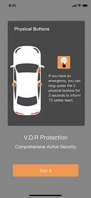
To make the V.D.R safety system easier to understand.
The problem: The customer couldn't understand the V.D.R safety system.
The goal: To educate the users about the V.D.R safety system of the onboarding pages.
Don't know
Onboarding page
Safety reminder Pop up
Location map of physical buttons
Got it
Two ways to get help
If the rider encounters an emergency, he can press the physical button for 3 seconds, which will allow the T3 safety team to see what is happening in the car through the camera and control the car remotely.
Onboarding 1

Onboarding 2

Pop up


Physical button in the car

Camera in the car


The Solution-3
Showing the usage process of the V.D.R Safety System.
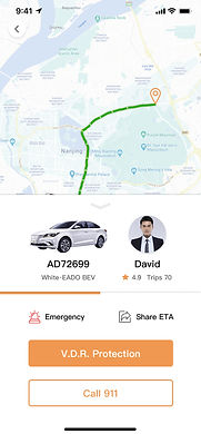
The problem: How to get more options to get help?
Need help
Call 911
Share route
Text to contacts
Text to friends
Connect with V.D.R
Connect with social media
Get help
Version 1
Same as tapping the "Get help" button to send voice and video via the camera in the car to T3 staff. Tapping the "Get help" icon would get emergency help for the rider or share ETA with three different groups.
First
After Testing
Logo color
Dark orange

It is important to add the current location here during the trip.
The user could tell the helper immediately.
Alarm color
Red


Version 2 - Final
Click

Details
Click
Details

Conclusion
According to the usability test report, our client agreed that our redesign solved the safety concerns. This should significantly reduce safety concerns in the future.
Impact -- 3 main KPIs
A year after we launched the app:
Bookings increased by 15%
Rider cancellations decreased by 8%
5-star rating app

bottom of page